Responsive images are always served at the same (reduced) size.
-
August 17, 2022 at 3:01 pm #8081
 [anonymous]
Hi!
I am on Publii v.0.38.3 (build 14238) + Simple 2.3.0.0. Lazy load and responsive images are enabled (60% quality, I recall it is the deafult value).
I’ve noticed that images inside posts (not externally hosted or of the GIF type) are always served at medium size (-md, 768px), regardless the viewport width. This makes some of them appear rather blurry, especially when choosing the wide image class. Featured images work as expected, though.
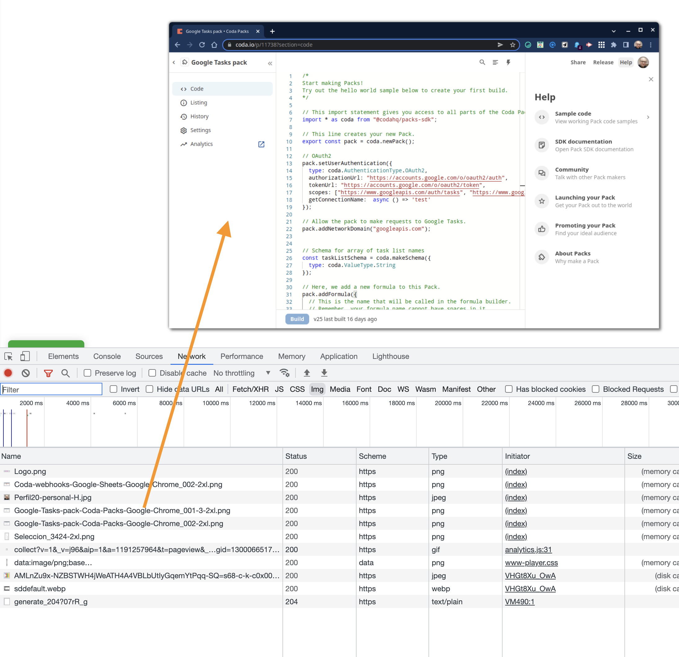
Example post: https://pablofelip.online/coda-webhooks-love-apps-script
I’ve not modified themes/simple/config.json at all:
"responsiveImages": {
            "contentImages": {
                "sizes": "(max-width: 48em) 100vw, 768px",
                "dimensions": {
                    "xs": {
                        "width": 300,
                        "height": "auto"
                    },
                    "sm": {
                        "width": 480,
                        "height": "auto"
                    },
                    "md": {
                        "width": 768,
                        "height": "auto"
                    },
                    "lg": {
                        "width": 1024,
                        "height": "auto"
                    },
                    "xl": {
                        "width": 1360,
                        "height": "auto"
                    },
                    "2xl": {
                        "width": 1600,
                        "height": "auto"
                    }
                }
            },
What might I be missing?
Thanks in advance.
August 18, 2022 at 7:46 am #8085Bob
It works very well for me, content images are displayed at the sizes specified in config.json (see the attached screenshot below). Overall, the browser ultimately decides what image size is best for the user.
 August 18, 2022 at 10:05 am #8088[anonymous]
Thanks for testing, Bob.
The problem I see is that
"sizes": "(max-width: 48em) 100vw, 768px"
is capping the width of my images to 768px when viewport > 48em (which is even a little less than the full width of posts when using this template). And if the css wide image class is chosen, 768px images are displayed inside a 1000px (in my setup) width area, causing a lot of blurriness.
I have changed that to
"sizes": "(max-width: 48em) 100vw, 1024px"
and now I am getting -lg versions of pics instead, which is good enough for me, pics are much sharper now.
I am not well acquainted with responsive design techniques, so I am afraid this is all I dare to try 😅, even though I understand this is rather suboptimal and probably very hacky.
August 18, 2022 at 10:13 am #8089Bob
It is quite hard to determine the correct image size when we have the possibility to change the width of the page, post entry, etc … that’s why our settings of the responsive images are quite general.
In terms of your case, what version of the Simple them are you using? In the recent version, there has been a change in the size attribute.
However, if you have already set up your website, I recommend using the Lint Images – https://github.com/ausi/RespImageLint – it’s a really cool tool.
August 18, 2022 at 10:30 am #8090[anonymous]
I am still on Simple 2.3.0.0, will check latest version.
I didn’t know RespImageLint, thanks for the suggestion. Getting this thing totally right seems very hard indeed.